


:max_bytes(150000):strip_icc()/drugstore-retinol-creams-tout-f76b9d2796e34eaa8376801c83fb1888.jpg)

Tan Color Pairings: What Goes Best with This Neutral Classic?
In the realm of design, color is not merely an accessory; it is an architectural element that shapes perception and evokes emotional responses. One of the most versatile hues in the palette is tan. This understated yet sophisticated shade serves as a timeless backdrop in various applications, from interior decor to fashion and graphic design. It possesses a unique quality that harmonizes with numerous colors, making it a favorite among designers seeking to create environments that feel both grounded and aesthetically pleasing. Understanding effective color pairings with tan can unlock a new level of creativity and functionality in your projects.
As we explore the compatibility of tan with various colors, it is important to appreciate its essence. The hue itself is derived from earthy tones and encompasses a myriad spectrum, from pale beige to rich sand. This inherent neutrality provides a canvas on which other colors can shine. The exploration of tan color pairings reveals not just visual appeal, but also the ability to convey messages, moods, and to reflect personal or brand identities.
In this article, we will delve deeply into the myriad ways in which tan can be paired effectively with other colors, elucidating the psychological implications and aesthetic outcomes of each combination.
Deep Dive into Complementary Colors: Amplifying Tan's Warmth
When contemplating color combinations, complementary colors often come to mind. These are colors situated opposite one another on the color wheel and tend to create a striking visual contrast. While tan is not a primary color on the wheel, it can play fascinating part in such pairings.
A soft blue or teal, for instance, effectively complements tan's warmth. This pairing can evoke tranquility and inspire feelings of relaxation. The coolness of blue plays off the earthy undertones of tan and creates a well-balanced visual symphony. Applications of this duo are myriad, from bedrooms that need a calm palette to branding that invokes serenity and trust.
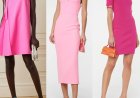
A splash of vibrant coral can also serve as a complementary color to tan. This pairing introduces an element of playfulness while maintaining a grounded aesthetic. The brightness of coral enlivens the subtlety of tan, creating a warm and inviting atmosphere, perfect for social settings or brand identities that aim to resonate with friendliness and enthusiasm.
For those interested in bolder aesthetics, pairing tan with deep shades such as forest green or navy can engender an elegant and sophisticated ambiance. These darker colors contrast with tan, thereby enhancing its neutral charm while adding depth and richness to the overall palette. Such combinations are especially effective in environmental design, where creating a luxurious, soothing atmosphere is paramount.
Traditionally, earthy color schemes—those that draw inspiration from nature—also benefit from the inclusion of tan. Deep browns and olive greens form beautiful triads with tan, producing a cohesive and harmonious visual narrative. This combination is evocative of natural landscapes and can ground any design with a sense of organic authenticity.
The Psychology of Color Pairing: Understanding Emotional Resonance
Separate from the aesthetic considerations, understanding the psychological implications of color combinations with tan can be incredibly enlightening. The study of color psychology reveals how different colors can evoke distinct feelings and behaviors—a crucial factor in design effectiveness.
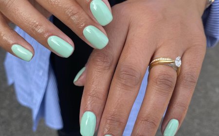
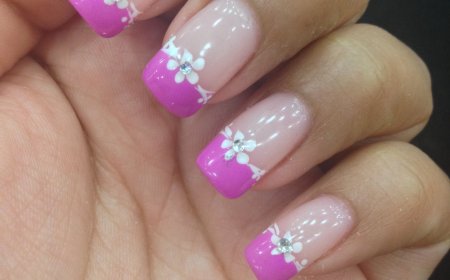
Consider the pairing of tan with soft pastels such as mint green or blush pink. This combination radiates warmth and gentleness, often associated with calmness and comfort. It is particularly effective in spaces that aspire to foster relaxation and nurturing, such as nurseries or wellness centers.
The inclusion of vibrant colors, particularly in children's products or brands aimed at younger audiences, can further amplify tan's essence. A striking orange or sunny yellow alongside tan brings vivacity and optimism into the visual context, appealing to feelings of joy and spontaneity. Such pairings are often harnessed in marketing to elicit enthusiasm and engagement.
In contrast, the synergy of tan with more muted, monochromatic palettes—such as grays and blacks—underscores a sense of professionalism and sophistication. This pairing is suitable for corporate branding or modern interior spaces, where clarity and efficiency reign supreme. The use of tan in these settings can soften the starkness of monochromatic palettes, creating an inviting yet decisively contemporary environment.
Natural Inspirations: Bringing the Outdoors In
Tan’s inherent connection to nature renders it a superb choice for designs aimed at bringing the outdoors in. Pairing tan with other organic colors can create an invigorating scheme that resonates with ecologically conscious consumers or nature enthusiasts.
Incorporating shades of green—whether in the form of soft sage or bold avocado—can captivate a sense of serenity while evoking images of lush landscapes. Such combinations can inspire designs reflective of the environment or those that aim to integrate natural elements, such as botanical prints in décor or eco-friendly branding identities.
Additionally, combining tan with shades of blue—whether it be soft sky blue or a deeper navy—portrays maritime themes and invites a breath of fresh air into any arrangement. This association can open pathways to designs that evoke freedom, calmness, and adventure, much like the sea’s horizon.
Utilizing tan alongside textured elements can also emerge as a successful strategy in design. Natural materials, like wood, provide not only visual interest but also an emotional connection to the environment. By integrating tan with textures that mimic natural elements, designs can benefit from the cozy and inviting aesthetics that emerge from wood grains, woven fabrics, or even stone finishes.
Conclusion: Leveraging Tan for Limitless Possibilities
Tan is more than a color; it is a multifaceted element in the designer’s arsenal. Regardless of the sector—from fashion to interior design—its versatility can yield striking results when combined with complementary and contrasting hues. Understanding the psychological implications of such pairings not only enhances aesthetic appeal but also enriches the emotional resonance of a design.
Ultimately, the true beauty of tan lies in its ability to adapt, making it an essential component in any creative undertaking. By exploring the transformative power of tan and its compatibility with an array of colors, designers can create spaces, brands, and identities that not only capture attention but also foster genuine emotional connections with their audience. As the exploration of color pairing continues to evolve, tan will undoubtedly remain a classic cornerstone, inviting new perspectives and igniting a sense of curiosity in all those devoted to the world of design.
What's Your Reaction?
 Like
0
Like
0
 Dislike
0
Dislike
0
 Love
0
Love
0
 Funny
0
Funny
0
 Angry
0
Angry
0
 Sad
0
Sad
0
 Wow
0
Wow
0